CSS Basic Layouting
This section will learn about CSS Basic Layouting

Basic CSS layout techniques are essential for positioning and structuring elements on a webpage. Here’s an introduction to some fundamental CSS layout concepts and techniques that are easy for beginners to understand and implement.
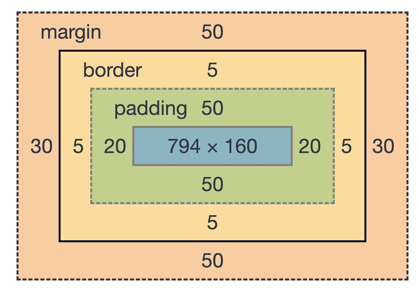
- Box Model
Every element in CSS is represented as a rectangular box. The box model includes the following properties:
Content: The actual content of the element.Padding: The space between the content and the border.Border: The edge surrounding the padding.Margin: The space outside the border, creating distance from other elements.
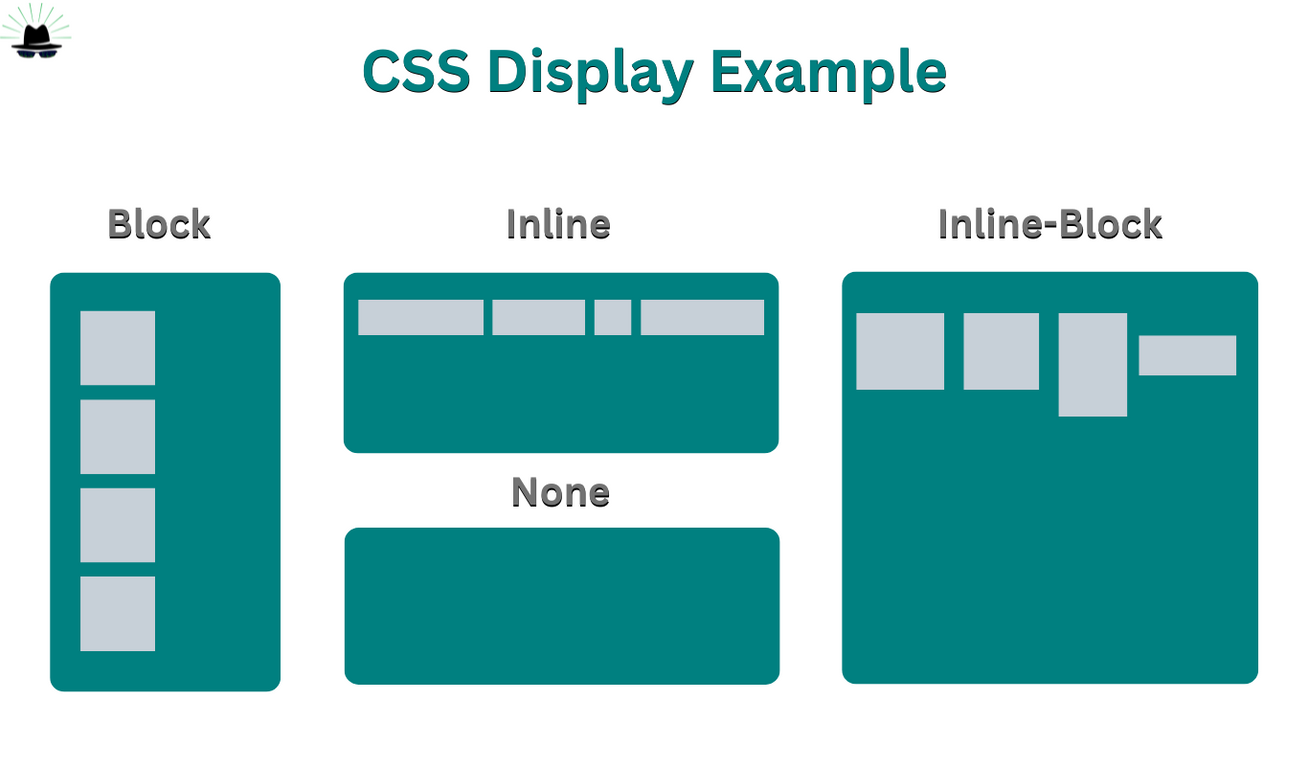
- Display Property
The display property determines how an element is displayed on the webpage.
block: Takes up the full width available and starts on a new line (e.g.,<div>,<p>).inline: Takes up only as much width as necessary and does not start on a new line (e.g.,<span>,<a>).inline-block: Combines characteristics of both block and inline elements, allowing for width and height settings while flowing inline.flex: Creates a flexible container to arrange child elements.grid: Creates a block of grid offers a grid-based layout system, with rows and columns, making it easier to design web pages without having to use floats and positioning.
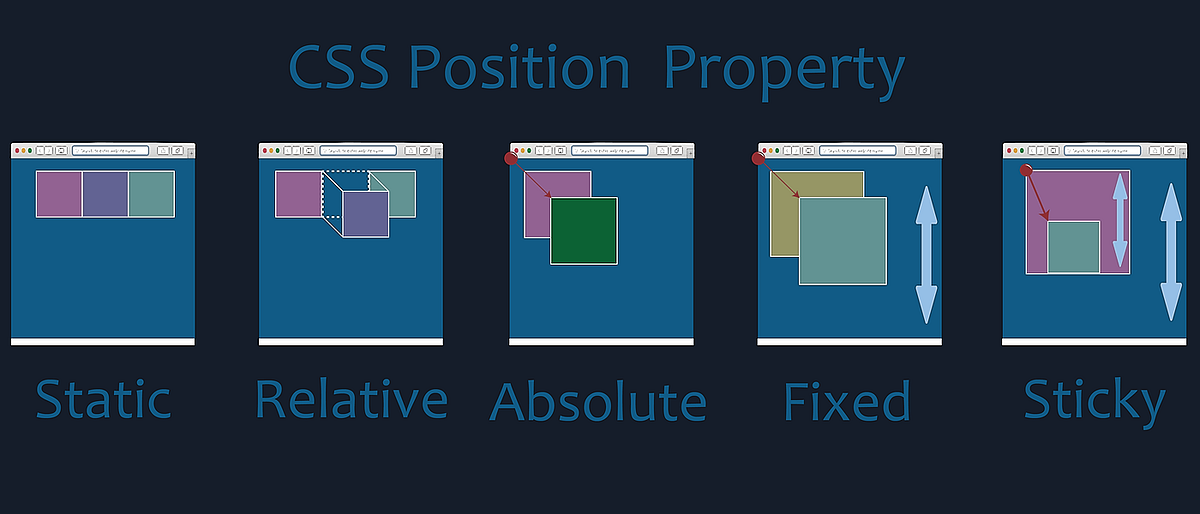
- Position Property
The position property determines how elements are positioned in the document.
static: Default positioning; elements are placed according to the normal document flow.relative: Positioned relative to its normal position.absolute: Positioned relative to its nearest positioned ancestor (not static).fixed: Positioned relative to the browser window, remaining fixed when scrolling.sticky: Switches between relative and fixed, based on the scroll position.
- Flexbox
Flexbox is a layout model designed to arrange items within a container, even when their size is dynamic or unknown.
Container Properties:
display: flex; makes the element a flex container.flex-direction: Defines the direction of the flex items (row, column).justify-content: Aligns items horizontally (start, center, space-between, etc.).align-items: Aligns items vertically (stretch, center, flex-start, flex-end).
Item Properties:
flex-grow: Defines the ability of an item to grow relative to the others.flex-shrink: Defines the ability of an item to shrink relative to the others.flex-basis: Defines the default size of an item before the remaining space is distributed.
.container {
  display: flex;
  justify-content: space-between;
  align-items: center;
}

.item {
  background-color: lightcoral;
  padding: 20px;
  margin: 10px;
  flex-grow: 1;
}
- Grid Layout
CSS Grid is a two-dimensional layout system for creating complex layouts on the web.
Container Properties:
display: grid; makes the element a grid container.grid-template-columns: Defines the number and size of columns.grid-template-rows: Defines the number and size of rows.grid-gap: Adds space between grid items.
Item Properties:
grid-column: Specifies which columns an item will span.grid-row: Specifies which rows an item will span.
Resources
For better understanding you can play some games for Flexbox and Grid with: